
Osesp
Visual Identity
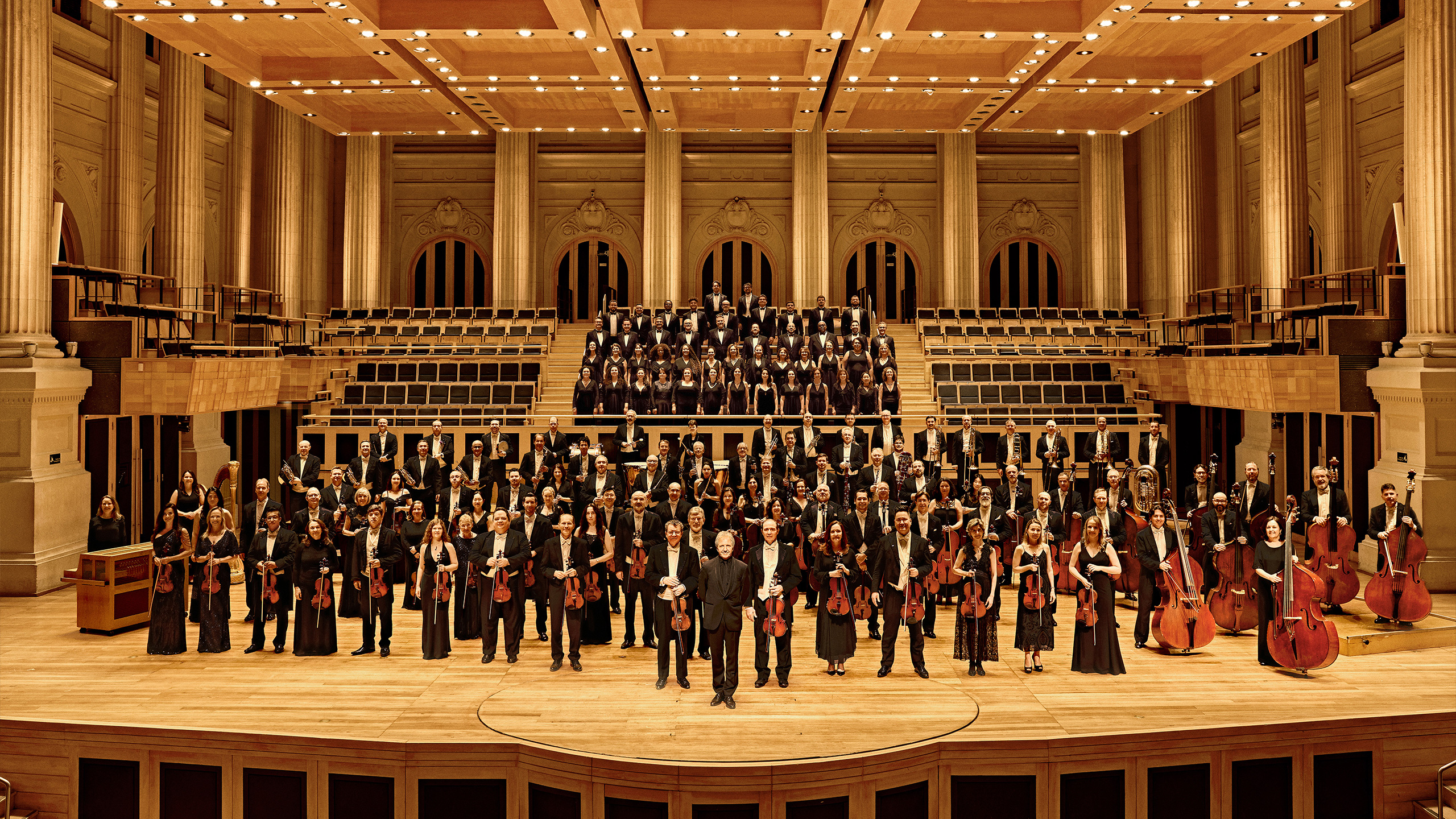
The São Paulo Symphony Orchestra (Osesp) is a key player in the cultural scene of São Paulo. Established in 1954, the orchestra has had its headquarters in various theaters and auditoriums, facing challenges and achieving triumphs along the way. In the field of graphic design, it gained recognition with the series of posters created by Kiko Farkas in the early 2000s, immortalized in the book "Musical Posters" (Cosac Naify). Today, based in the iconic Sala São Paulo, Osesp is acknowledged as the best Latin American orchestra.
In 2023, Polar was invited by Osesp to revisit its graphic legacy and develop a new visual identity, adaptable to its diverse application needs and capable of attracting a new audience to discover it. The new identity, aiming to be a sensory and captivating invitation to rediscover classical music, was conceived through the juxtaposition of two distinct layers.
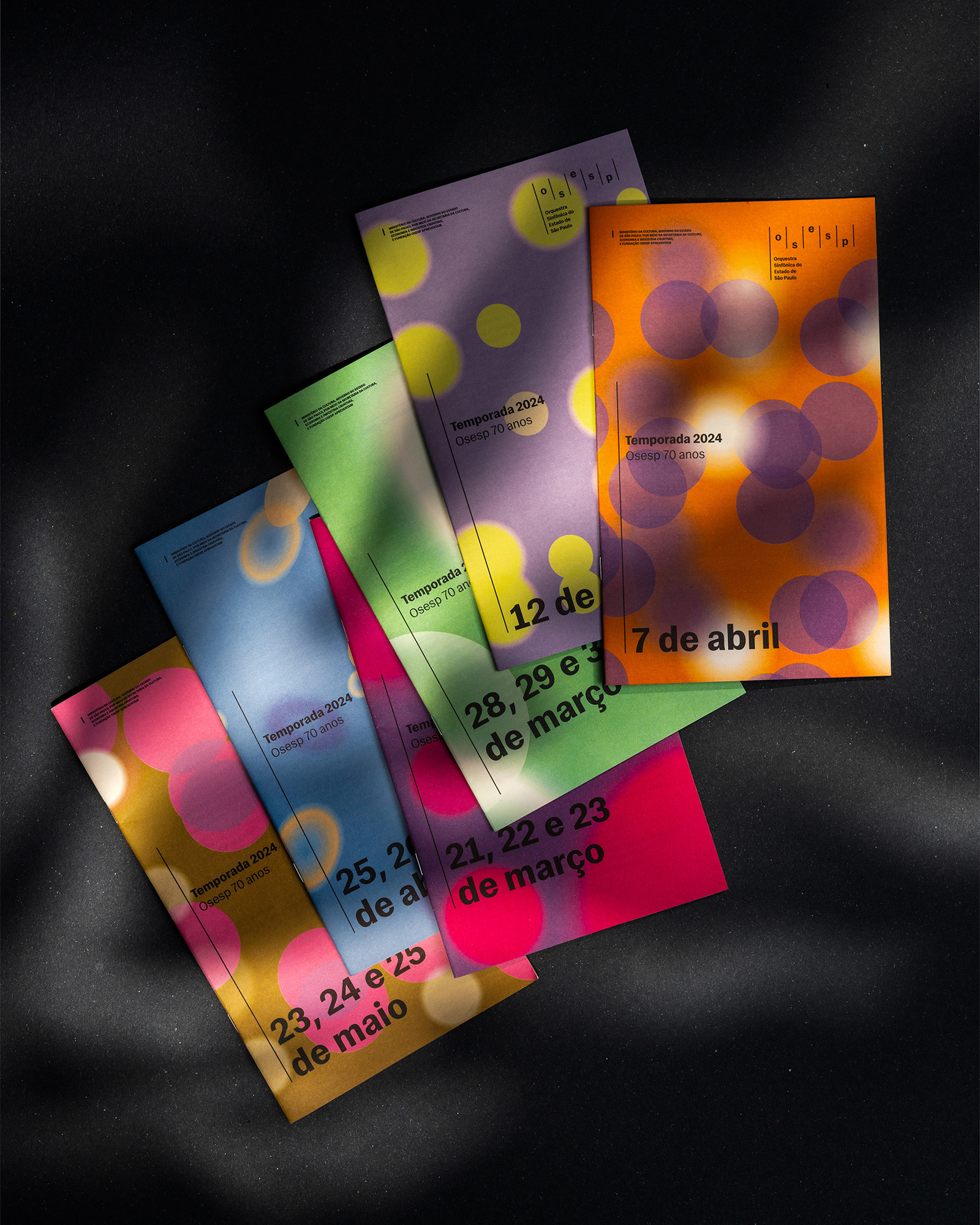
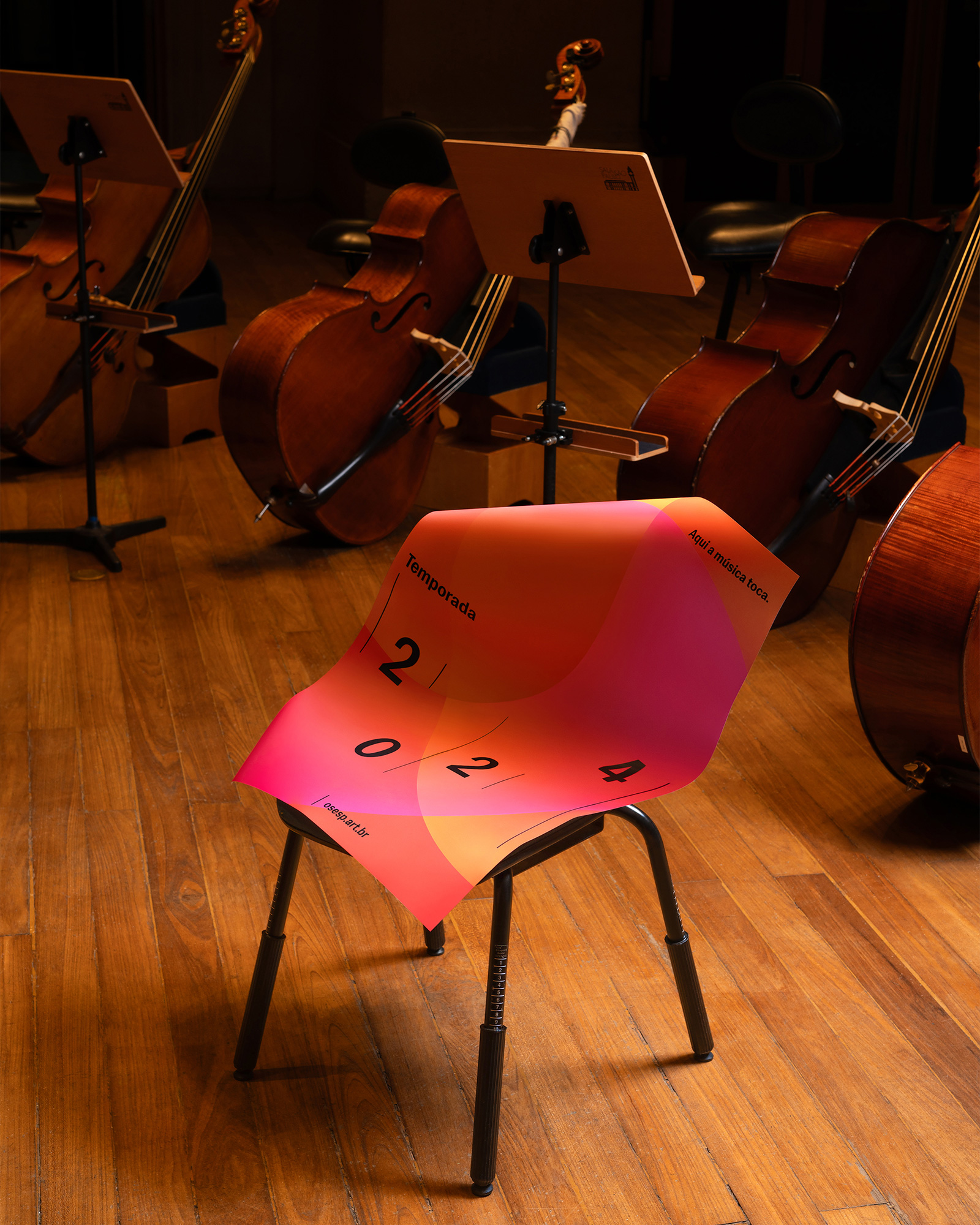
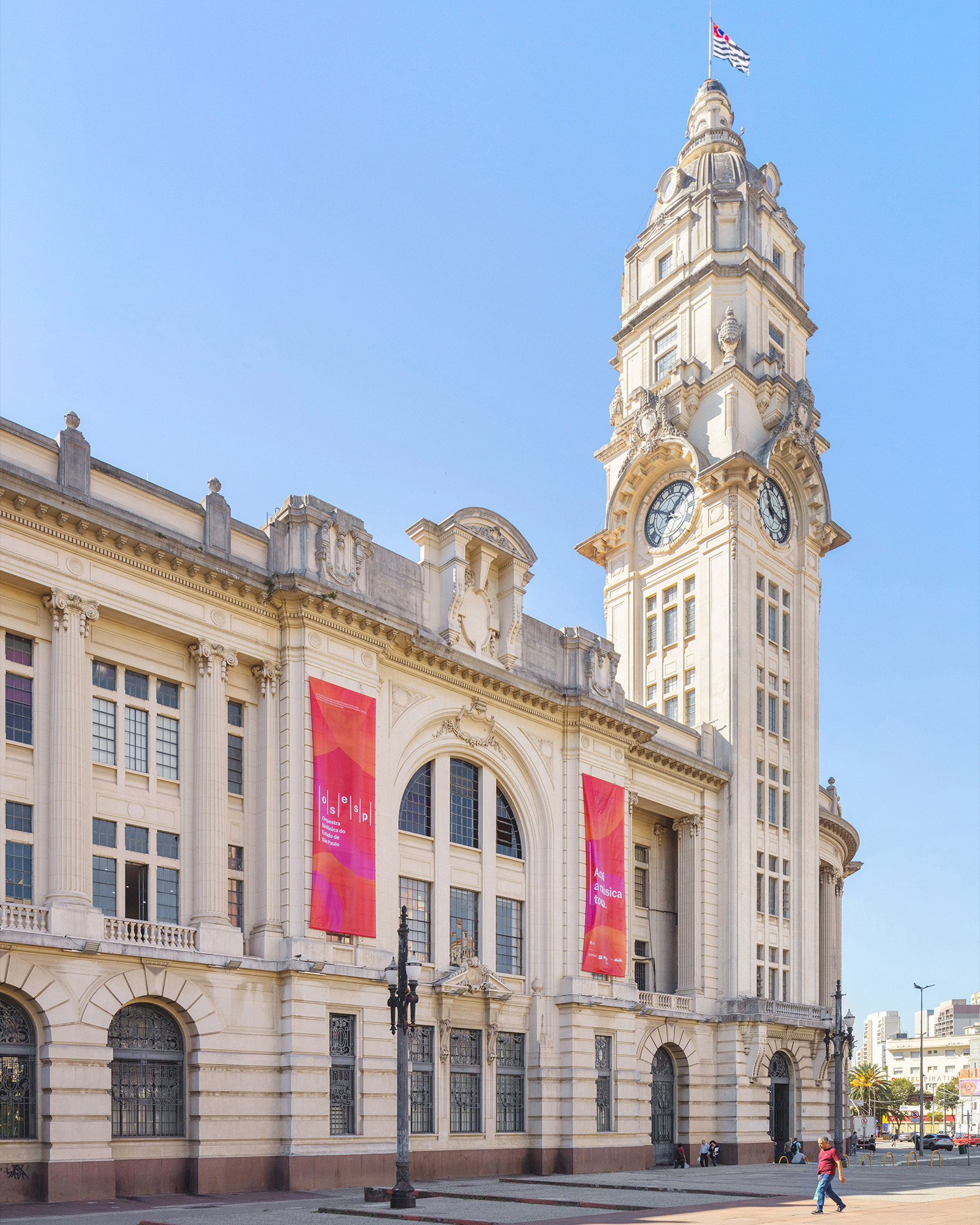
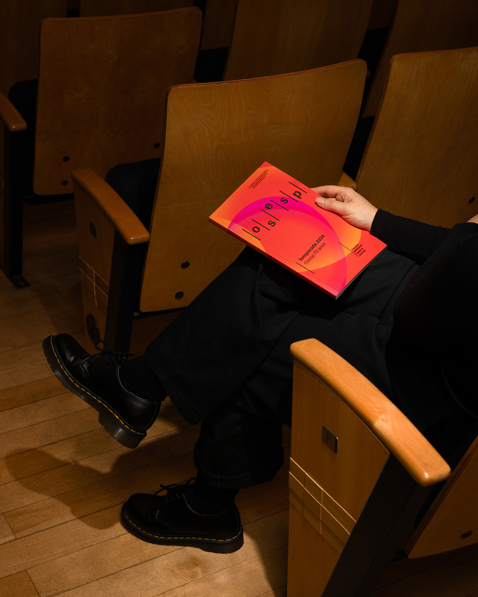
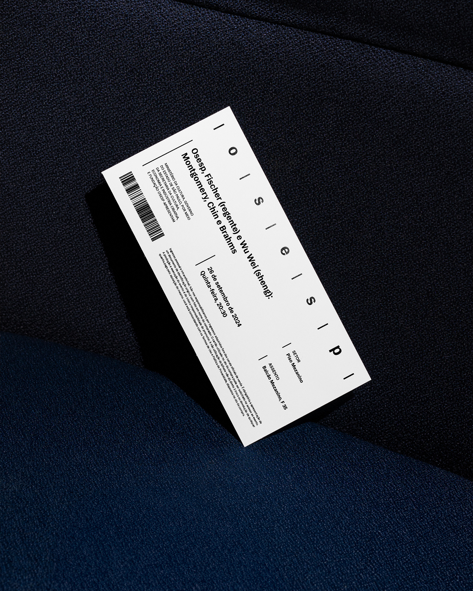
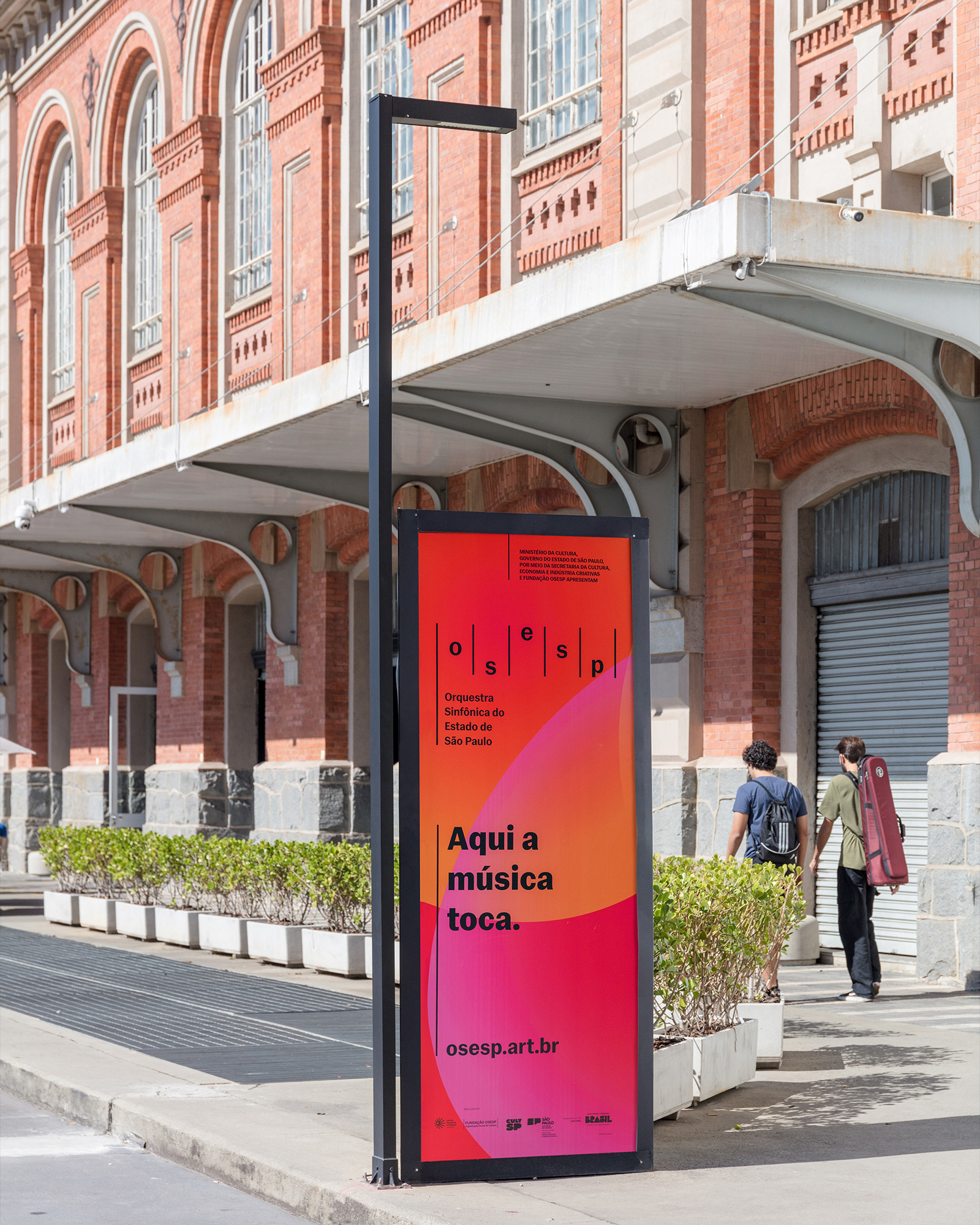
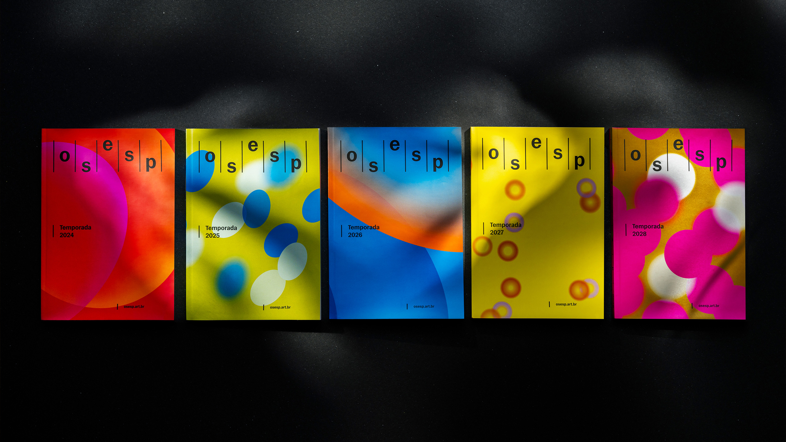
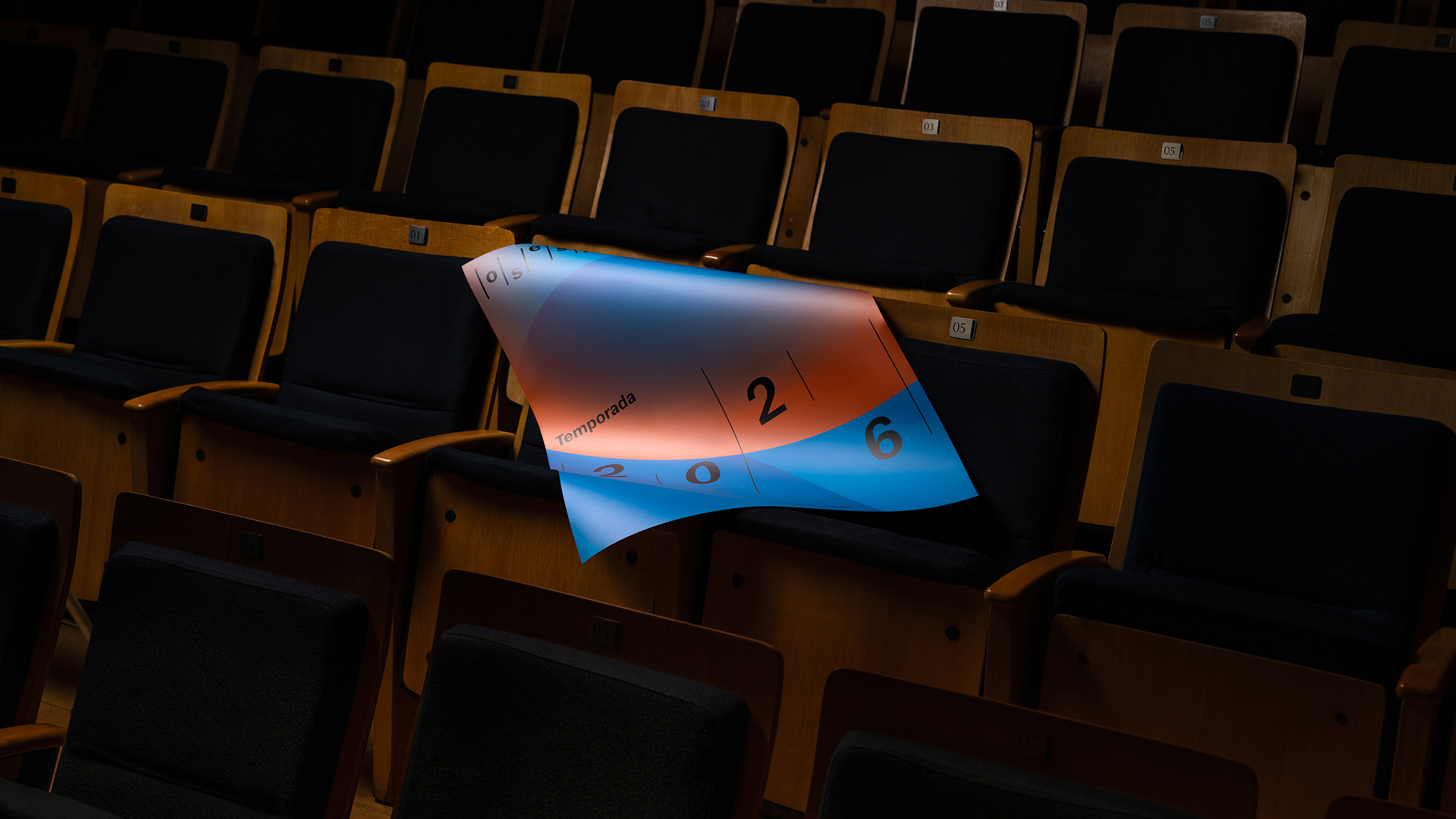
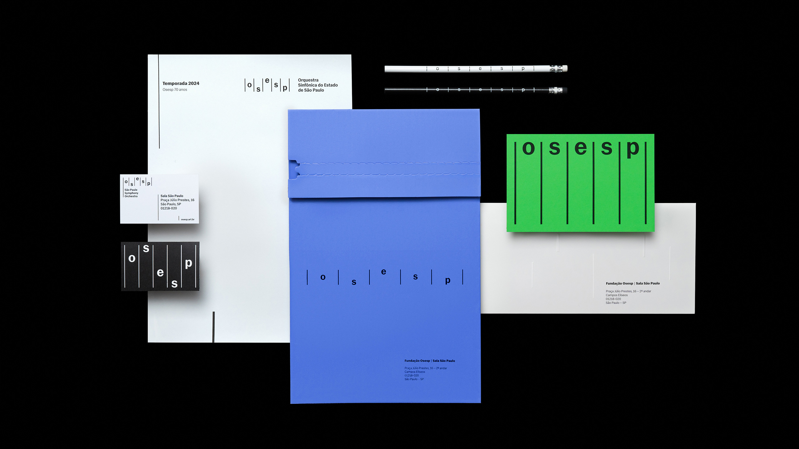
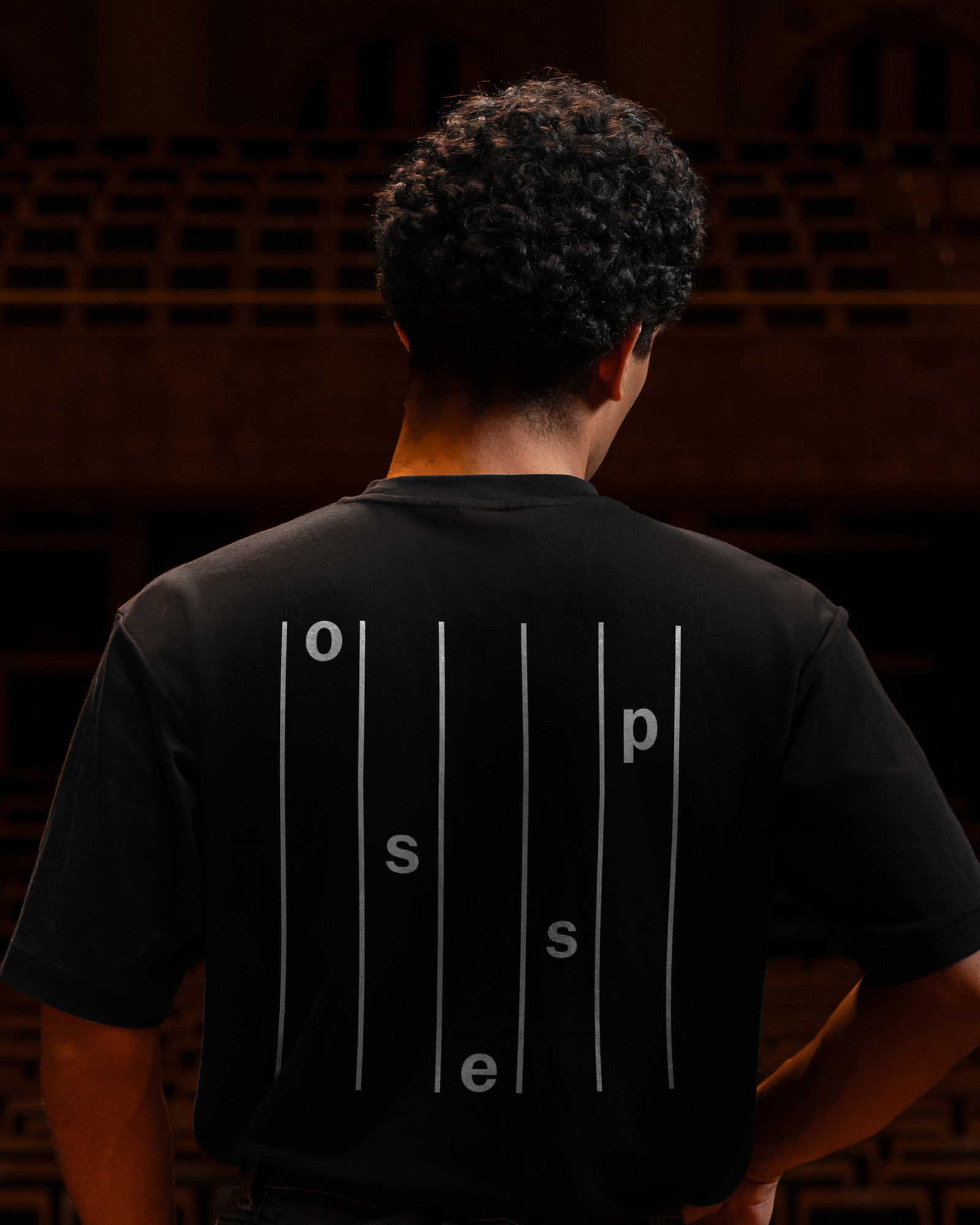
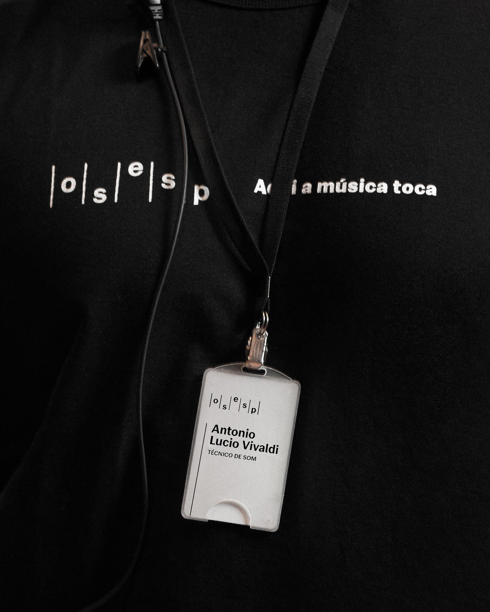
The first layer, rational and disciplined by nature, emphasizes the dialogue between time, rhythm, and tempo. This approach is reflected in vertical bars that run through the entire graphic system, as well as in the flexible logo, where the letters forming "Osesp" are arranged like musical notes in a nod to a music score.
The second layer of the visual identity focuses on emotion and seeks to express, with sensitivity, the experience of listening to and watching the orchestra. In this aspect, a grouping of shapes reacts to musical information, transcending the technical aspect of sheet music. The abstract graphics represent the sensations and moods evoked by the music. To create these elements, a generative design system called "Instrument" was developed. In this system, a sound input is visually translated into compositions of ellipses, allowing for the creation of infinite compositions and a connection with the pieces they reference.
The color palette, with its variety, provides the flexibility needed to reflect the diversity of emotions conveyed by the orchestra. Additionally, it facilitates the creation of derivative identities for specific projects, keeping the brand constantly refreshed over the years. The typographic voice of the institution is entrusted to "Gal", designed by the Brazilian type foundry Blackletra, with a highly functional design that connects with the music universe from its inception.


Credits
Client
Executive Direction: Marcelo Lopes
Marketing and Comms Director: Mariana Stanisci
Comms Manager: Mariana Garcia
Head of Arts and Design: Bernard Batista
Studio
Creative Direction: Lais Ikoma / Ralph Mayer
Design: Lais Ikoma / Ralph Mayer
Research: Stella Bonici
Motion Design: Ronaldo Arthur Vidal / Rônatan Bica
Creative Code: Ariel Tonglet
Case Study
Creative Direction: Lais Ikoma
Design: Lais Ikoma, Ralph Mayer, Satsuki Arakaki
Motion Design: Ronaldo Arthur Vidal, Rônatan Bica
Photography Art Direction: Lais Ikoma, Ronaldo Arthur Vidal
Spatial Photography: Tuca Vieira
Case Study Photography: Naira Mattia, Daniel Queiroz (assistant)
Orchestra Photography: provided by Osesp
Collaborators
Brand Strategy: ACE
Creative Direction: Marcella Brito Franco
Planning Direction: Felipe Teobaldo
Account Direction: João Paulo Silvares
More from Polar


1stAveBa
Gdor. Valentín Vergara 1119
Vicente López, Buenos Aires
Mail
1stAveNY
20 Jay Street, Ste 902
Brooklyn, NY 11201
Mail
1stAveLON
Tea Building, 56 Shoreditch High St
London, E1 6JJ, UK
Mail
1stAveLa
24955 Pacific Coast Highway, Suite C202
Malibu, CA 90265
Mail
Follow Us!