
Trybe
Visual Identity
Combining education and technology, Trybe prepares people to meet a growing demand in the tech area in Brazil. Focusing on employability, the school offers training for developers and connects them with companies that recruit these professionals: a model that has been standing out for having a significant impact on students' careers and on the Brazilian market. The relevance achieved by Trybe quickly created the need for a brand compatible with the size of the company and the teaching experience, as well as a visual universe capable of speaking directly to its community.
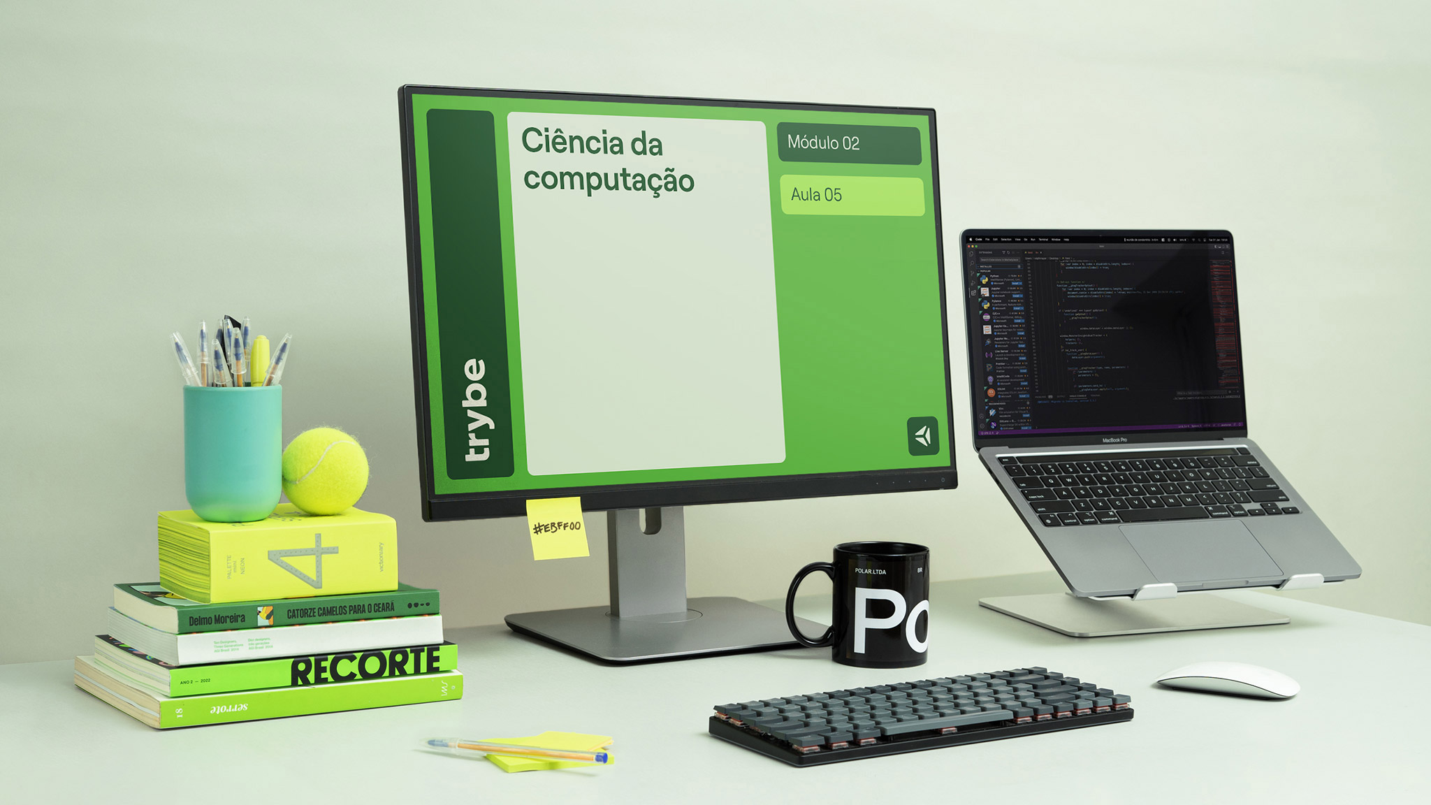
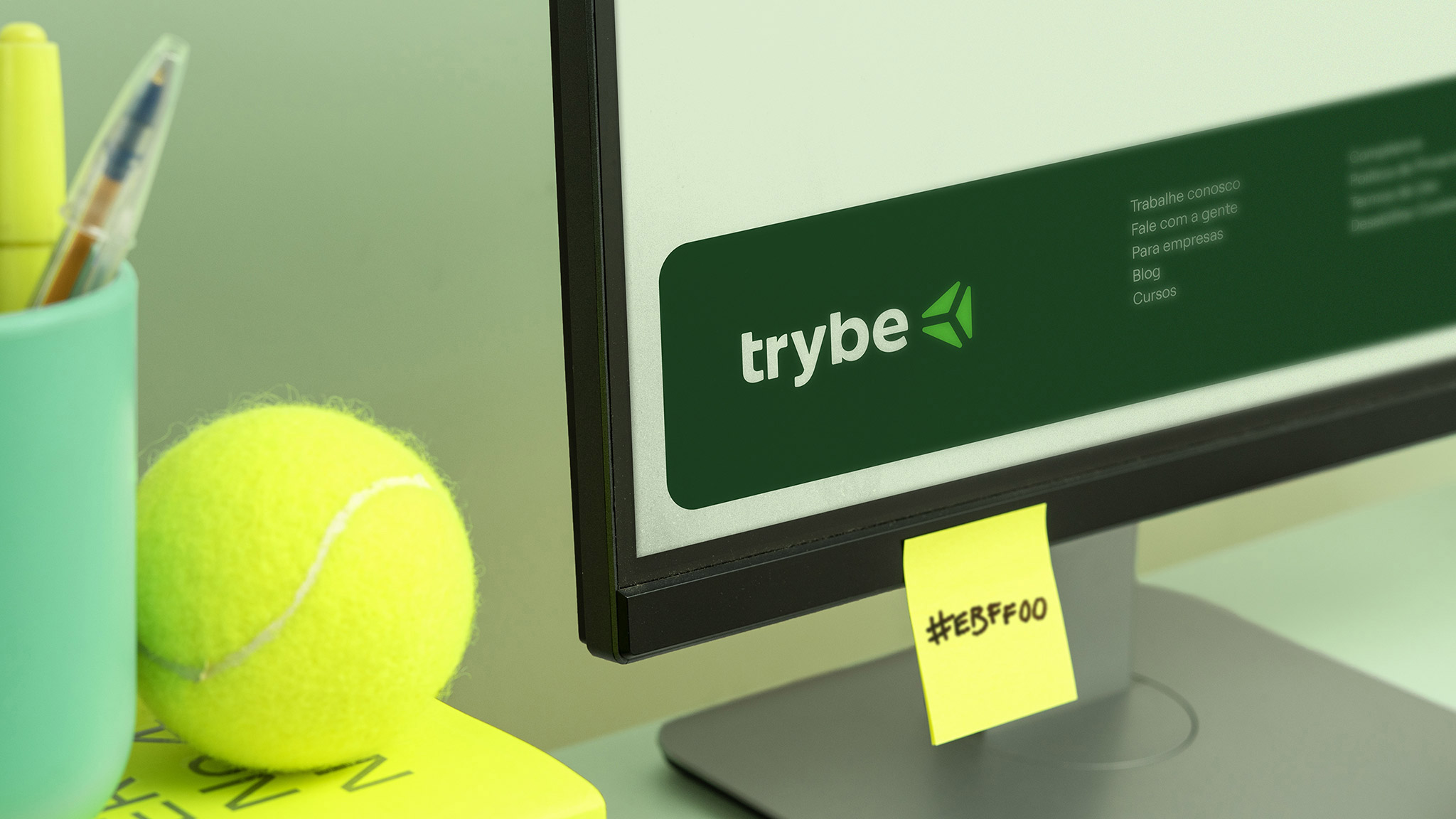
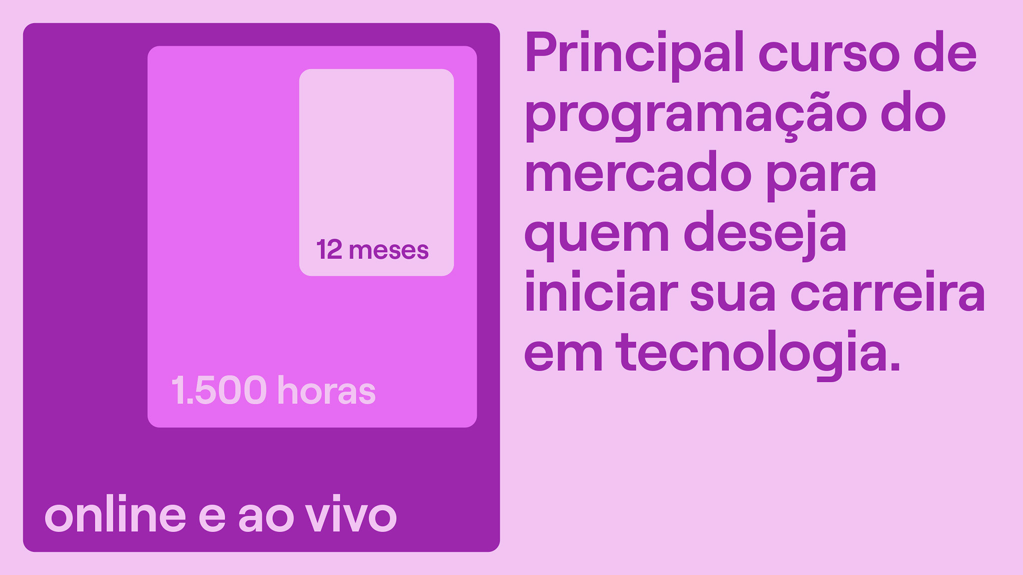
The modular grid concept permeates the entire design system, and can be seen from the construction of graphic elements to the composition of layouts. In a flexible logic, the windows structured in squares and rectangles are organized to meet the needs of the content, whether texts, images, vídeos or illustrations, ensuring unity in the visual language of the most varied pieces. Harmonically dialoguing with the symbol, which has received subtle adjustments, the logotype was redesigned with an exclusive typography that brings consistente proportions and details that confer originality.
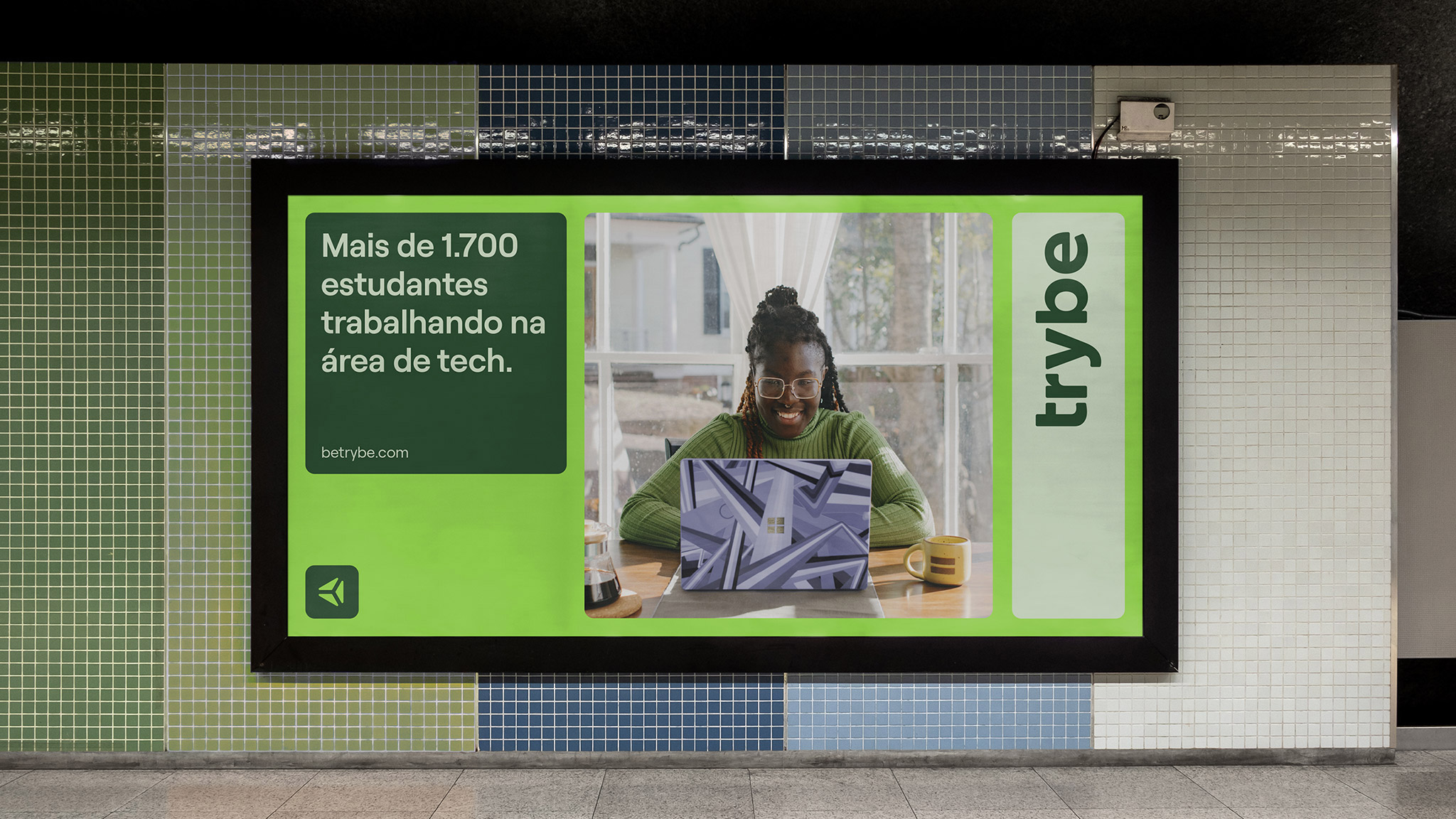
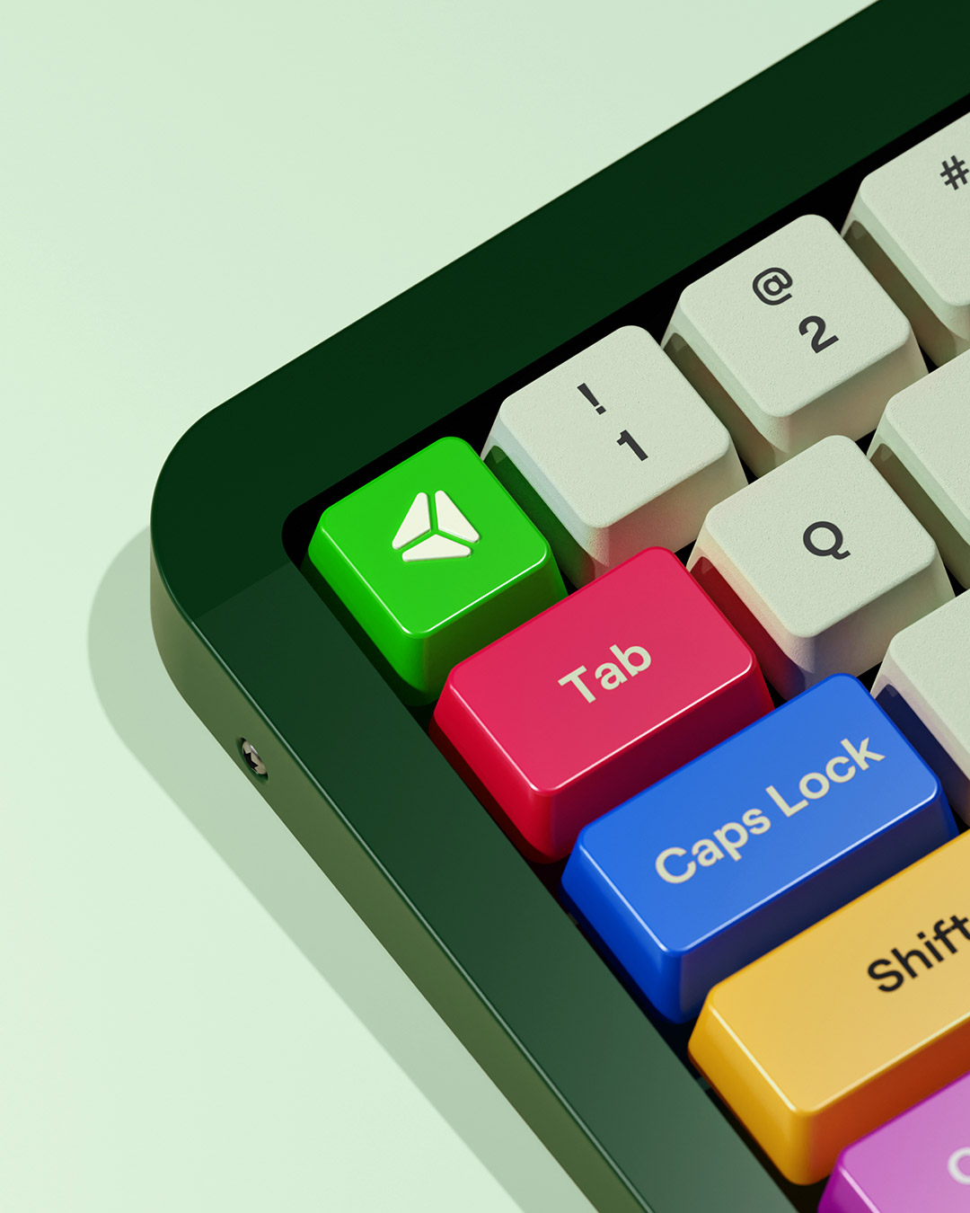
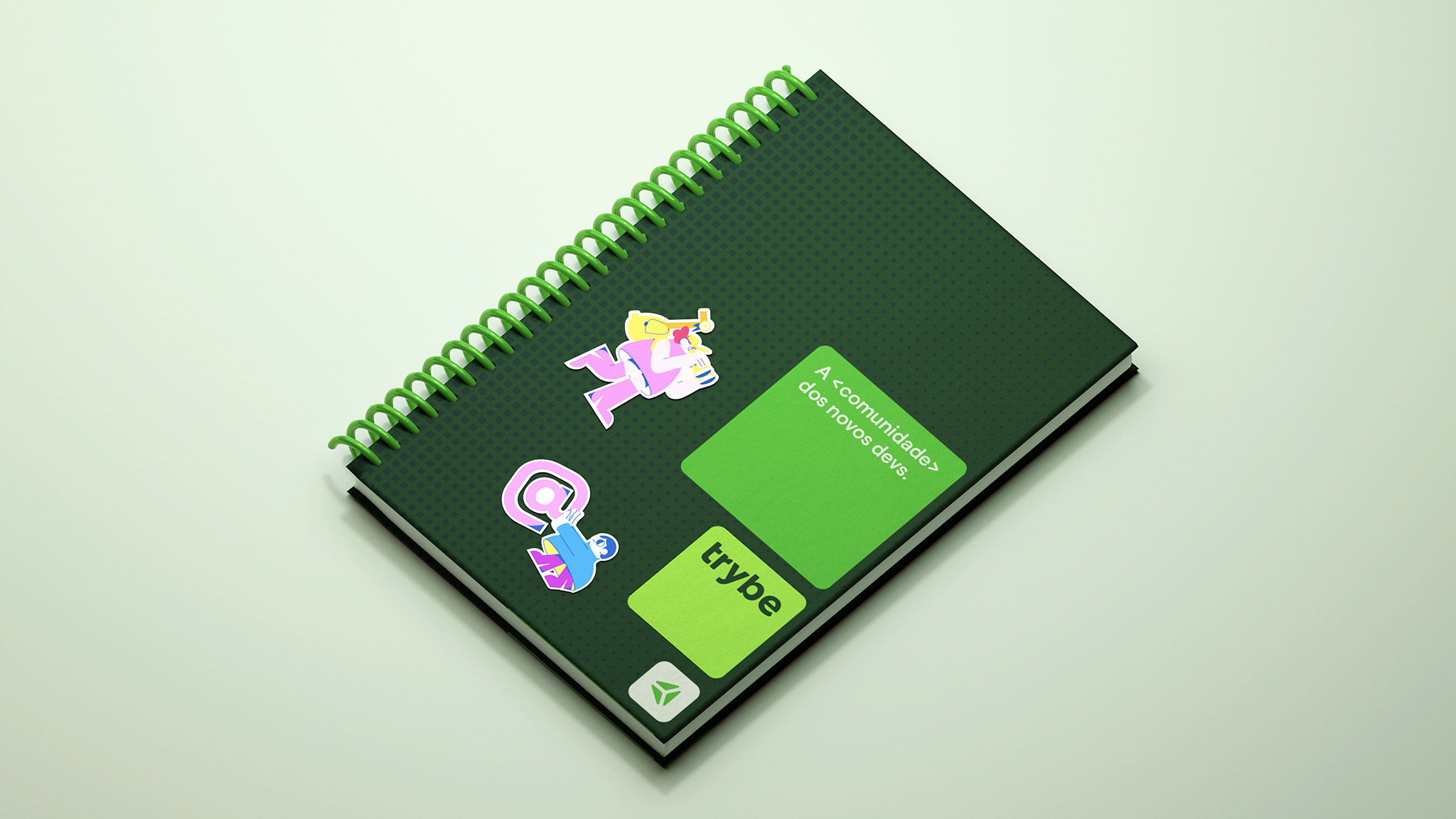
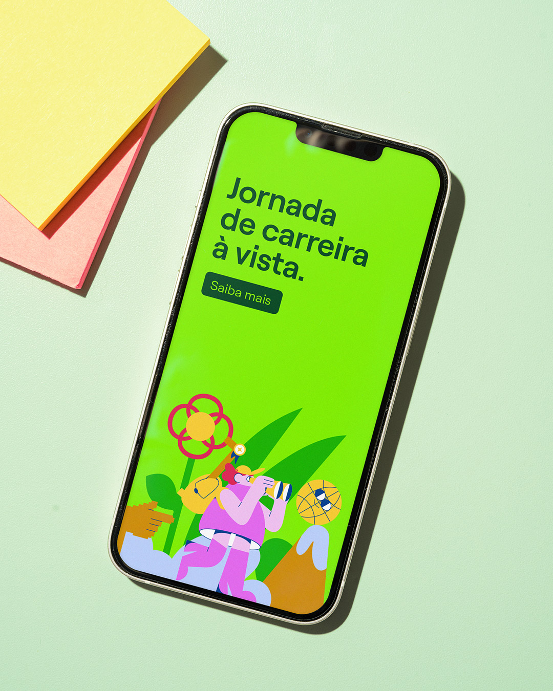
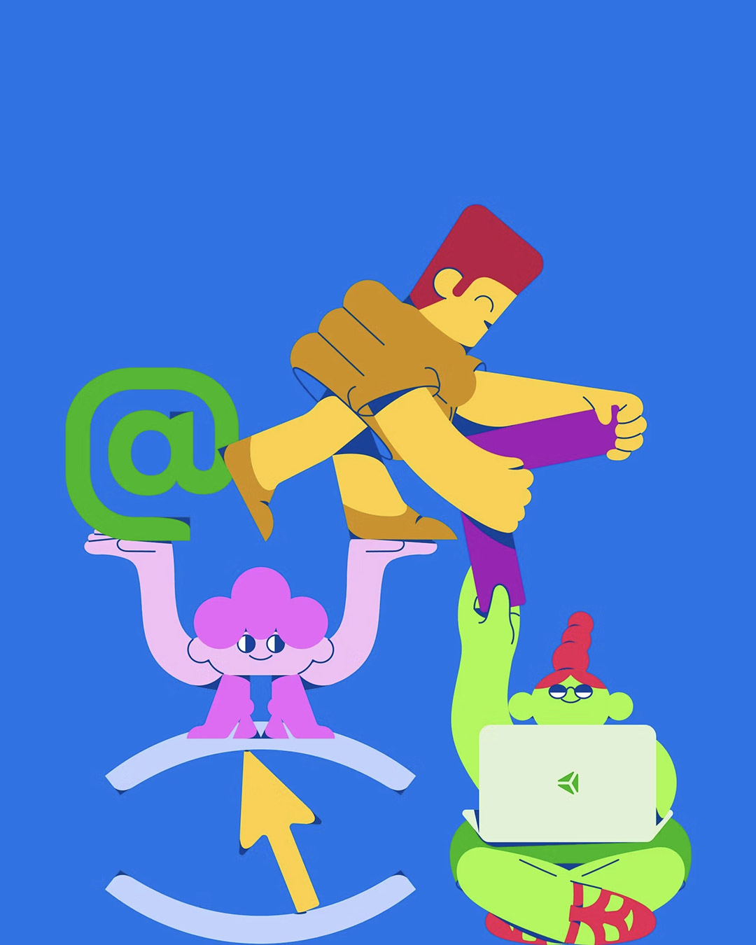
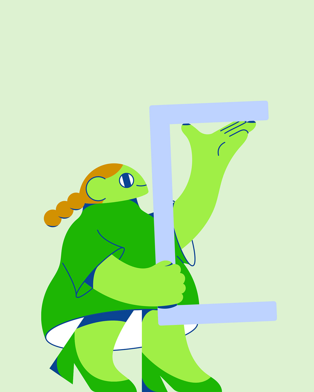
In addition to the chromatic realm, previously established by the color green, the color palette has been expanded to accommodate a wide variety of expressions within the system. Another important resource proposed is the illustration style, capable of representing importante attributes of Trybe's lexicon such as technology, education and accessibility. Making use of geometric shapes, the scenes portray the support offered to students in their trajectory within the school, while exalting the individuality of each one.
Finally, the system also comprises rulings for the animation. Values such as evolution, ascension and belongingness guide the movement decisions of visual tools, such as logo, typography, transitions and title cards. In this way, Trybe's motion identity reaffirms and expands its expression in the details, reinforcing values such as learning, trust and innovation.


Credits
Client
Laio Kogawa
Leticia Pettena
Ligia Salton
Luisa Lisboa
Studio
Creative Direction: Ralph Mayer / Ronaldo Vidal
Design: Matheus Costa / Ralph Mayer / Ronaldo Vidal / Satsuki Arakaki / Stella Bonici
Illustration: Stella Bonici
3D Design: Matheus Costa
Motion Design: Ronaldo Vidal / Rônatan Bica
Logo Redesign: Satsuki Arakaki
Case Study Photography: Ronaldo Vidal
More from Polar


1stAveBa
Gdor. Valentín Vergara 1119
Vicente López, Buenos Aires
Mail
1stAveNY
20 Jay Street, Ste 902
Brooklyn, NY 11201
Mail
1stAveLON
Tea Building, 56 Shoreditch High St
London, E1 6JJ, UK
Mail
1stAveLa
24955 Pacific Coast Highway, Suite C202
Malibu, CA 90265
Mail
Follow Us!